Monday, 2 May 2016

Question 5

How did you attract/address your audience?

I attracted my target audience by using conventions and features that would draw in my target audience, which is professional working adults between the ages of 25-45. I feel that the primary feature that would attract my target audience would be the artists i have featured. For many of my artists, such as Elton John and Paul McCartney, their primary fan bases are in this age demographic, though more towards the upper end, at around the age of 40. This could be contrasted to the lower end of my age group, which would be more accustomed to the likes of Philip Selway, as well as my own original artists, Jordan Lloyd, Zhao and Navarro. By dividing the target age group with 20 years, but uniting them under the genre, the magazine could attract the target audience into the single magazine, thus selling more issues. This also served to broaden my target audience into different age groups, which would then make it easier to appeal to the mass audience, while including some features that the other parts of the target audience would enjoy.

There are several features that i feel would appeal to my target audience. Firstly, the house style is very reminiscent of Q and Mojo, which are not only my style models, but share a similar target audience to my own magazine. So the readers for them magazines are likely to buy my magazine as they will recognise the style and therefore genre. In order to replicate the similar house style of Q and mojo, i used a very similar font to mojo in my magazine which was used in a colour scheme which is similar to Q's primary colour scheme of red, black and white. The colours used represent both formality, seen with the black and white, and the rock genre of my magazine in red. I used red in order to stand out from the background and other text and attract my target audience as red is a colour that q associates itself with, so the target audience will be able to identify the genre from the colours i have used.

I also made sure to use very large and bold text for the headlines and masthead in order to not only stand out, but to also attract my target audience as it is a font and colours scheme which is reminiscent of Q.

Furthermore, i used features that are common across all magazines and directly address the target audience. The biggest example of this can be seen with the subscription offer in my contents page, which would attract my target audience as it offers a reward for the target audience subscribing to the magazine, which therefore would give them the magazine to read per issue, therefore ensuring that there is a fan base behind the magazine, regardless of the musicians included.


Question 4

https://www.slideshare.net/secret/nxVmgutCtGDI3p


This is a link to my Slide share response to question 4

Sunday, 1 May 2016

Question 3

What kind of Media institution might distribute your product and why?


Bauer is a publisher that already owns Q, Mojo, both of my style models, and Kerrang! Kerrang! is a rock magazine that shares many similarities to my own, in terms of genre and some aspects of house style. Due to the success of these two magazines, both of which share my genre of music, i would feel confident in Bauer distributing my magazine.While they are a privately owned company, Bauer own all of the aforementioned magazines as well as many more across the world, although they do have a headquarters in Hamburg,Germany. A advantage of picking Bauer media over other publishers is that they already have had prior experience with music magazines, especially magazines of my genre, and they would be able to attract my target audience as they have proven to be able to do so with several other brands.

 They have shown to be able to adapt the brand over to different media platforms, for example, Q magazine now have success in radio and on digital platforms with websites and social media. Under the supervision of Bauer, my music magazine would be able to reach a much wider audience than it would from just print sales. However, the issue with using Bauer as a publisher is that they already own magazines that are similar to mine,including my style models and there wouldn't really be a gap in the target market for my magazine. This would limit the interest my target market and audience would have in my magazine, and this would be further decreased if Bauer put little funding and marketing behind my magazine in comparison to another of its brands like Q or Mojo.

Furthermore, i have looked at alternate publishers for my magazine, but the primary one i considered was Haymarket Media. These are a privately owned publisher based in the UK, however they have recently began expanding overseas and now have headquarters in countries like the USA, Germany,India and Hong Kong. This would help to appeal to a worldwide market and not just my target audience in the Uk, but fans of the genre across the world. Additionally, they operate over different media platforms and not just with magazines, and the companies use of these different media platforms would be beneficial in marketing over a larger audience than what is normally possible.

On the other hand, the publisher has had little experience with music magazines of my genre and target audience, which therefore gives doubts about their ability to market this correctly to the target audience. They would not know the correct sort of advertising for this, and they may not know crucial marketing knowledge, including where to put the magazines in the store, and what sort of features in my magazine they wish to market at my target audience.


Another potential publisher that i have looked at is Time Inc, who are a publisher that have a headquarters in the UK. They recently changed their name to Time Inc from IPC media, and they clearly have a successful history with publishing and distributing magazines, with their current sales of 350 million issues a year over their magazine subsidiaries They have published such magazines as NME, and i feel that they would be a good choice for marketing my magazine to a more mainstream audience, as they don't really have anything currently that shares my genre and target market. This means that they are able to put more attention into my magazine than Bauer would, as it does not have several other brands with a similar target market. The popularity and success of Time inc means that they are also going to be suitable for a large financial backing, again which i contrasted to how i feel Bauer would back my magazine.

Looking at the pros and cons of each individual publisher, both in terms of their popularity in terms of both sales and marketing, and their general suitability for my magazine, i can conclude that Time Inc would be the ideal publisher and distributer for my magazine. This comes down to a number of factors, however i believe that it is the mainstream popularity and a gap in the lineup of brands they own for my magazine which were the contributing factors in my decision.


Friday, 29 April 2016

Question 1

In what way does your media product use,develop or challenge forms and conventions of real media products?

My magazine takes plenty of inspiration from my style models, merging elements from each as well as incorporating different features to make it unique.
Front Cover layout and conventions

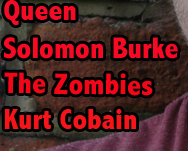
For my front cover, i largely took influence from Q magazine, in several ways.Firstly, the magazine as a whole has a distinct house style of red,white and black, which is based of Q's own. This allowed me to make my text and shapes very distinct from the main image and meant that i did not have to remove the background in order to actually see my text. I also used masthead in a similar way, putting the large, red font text over a white background at the top of the page. This draws obvious parallels to Q's, however, my masthead covers the entire top fifth of the page from left to right, whereas Q's is generally in the top left corner with the single letter name. Furthermore, the magazine's shot is one inspired by Q's common use of close ups on the artists on the cover, which serves to further align my magazine with my style models. The image used has a brick wall as the background, and this is in order to give the rockstar look to not only my actor, but the entire cover as a whole. Furthermore, my cover incorporates a slogan which is inspired by my other style model Mojo. I chose to incorporate this in order to suggest the class and high standards of the magazine, and it is in a white font in order to contrast the background and masthead font. There are also elements that are similar to Mojo, such as the lists on the side for the other artists featured. For this, i chose to select a wide range of different artists from bands and solo musicians. This ranged from the likes of Paul McCartney and Elton John, who are generally aiming their music at the late 30's and 40's, which is at the top end of my target audience's age demographic. On the other hand, i also incorporated more recent rockstars such as Philip Selway, mixed in with some of my original artists such as Zhao and Navarro. These are aimed at the mid 20's age demographic in my target audience, this is in order to have a wide range of musicians within my magazine genre, making it more accessible and it is more likely that the numerous fan bases for each artist will be interested in s anything regarding them. Additionally, i decided to add anchorage text,(featuring the artists), which would be advertised to the reader with the large bold text saying,"Plus!", and,"Also!". This is in a bold white font in order to stand out from the background, making it easier to spot for a reader, as it lets them know that there is more content that they may like. I also decided to add a few minor details, which makes it feel more like it fits in the genre alongside Q and Mojo. These included the barcode, which is a necessity on a magazine, as it is how the issue is sold. Without a barcode, not only would the magazine be unable to purchase by conventional means at the shop, the potential reader would doubt it's credibility as the magazine is lacking its own sort of id in the shop and amongst the other magazines. Another minor convention that i added was the date and price to the cover. The date is needed so that the readers know that the magazine is up to date and some would value this as crucial when buying a magazine. The price was also required as it is important for the readers to know the price of the magazine when coming round to buying it.  The price itself is based of Q's and Mojo's price range of £4-£5, further aligning my magazine in the genre alongside my style models. This price is typical of the genre as the magazine has formal and class elements to it, such as the language and organised  conventions. 


Contents page layout and conventions
On my contents page, i once again took heavy inspiration from my style models, especially Q magazine. The gridded images is meant to be reminiscent of Q's style of contents page, with smaller features like the numbered images and the main article having the largest picture. Each image is representing the article it is numbered, for example, the image of queen represents the queen article. I have also added convergent links at the base of the page, linking to the magazine's social media accounts on both Facebook and Twitter respectively. This helps to attract the readers to other platforms that many other magazines, including my style models, are capitalising on. I also decided to add a paragraph, separate from the rest of the contents, discussing a subscription service, with potential rewards if the reader subscribes. The rewards i selected was a i tunes gift card and a entry into a £10,000 lottery amongst subscribers. I feel that the gift card is appropriate as it allows the readers to download more music, likely to be made by artists featured in my magazine. This would keep the reader and target audience invested in the magazine as they would see the artist they have downloaded music from appear and promote new music giving the audience a chance to  learn more about them by buying the magazine. The contents also adds the issue number, which allows for the reader to keep track of how long the magazine has been running. I chose not to add this to the front cover due to the lack of a place where it would fit well. A convention that i felt was integral was the addition of the page number at the bottom corner of the page, which is seen in pretty much every magazine, regardless of genre. I also included a large title for the page, named Contents, and this is the most obvious and stand out text, in order to attract the reader, and to inform them very easily of the pages purpose. the individual images of my own artists have been designed to fit the aesthetic of my magazine especially, and can be seen in the primary image of the contents page. The image shows my actor wearing very casual clothes, which is meant to represent the genre well, and reflect  his casual attitude, which in turn would appeal to the target audience for my magazine, as this casual attitude is a common look for rock stars.


For my double page spread, i used a shot of the artist looking across to the other page. This is in order to connect the two pages easier and is very common in all music magazine genres and not just rock. I chose to make the headline large and bold in order to stand out in the middle of the page, as well as placing a pull quote directly beneath it. This gives the reader a impression of what he will be discussing in the article. Pull quotes are extremely common in music magazines and both of my style models use them to great effect, as they give the reader insight into the discussion and goes as far as to reveal aspects about their personality. In this instance, it tells the reader that the interview is going to be positive and that the interview will go into the artists life specifically. I made sure to measure the three columns correctly in terms of width, in order to create a accurate reflection of the typical rock magazine's double page spread. I added a credit for myself as the writer of the article and interviewer, a convention which is common, and i added appropriate font to align with this. The font is meant to evoke a writing style, which not only distinguishes itself from the other text on the page, but gives the text a personal, hand written feel. I also incorporated the page number onto the page in order to maintain a sense of direction within my magazine for my reader, and works in conjunction with the contents page. I made sure to make the page numbers align with what i had previously labeled them in the contents, in order to maintain a continuity in my magazine. So to follow this, i made sure to give the page numbers 22 and 23, which aligns with the page as it is specified in the contents.


Assessing my coursework

Level 3

I feel that my magazine front cover shares many similarities with this example. The magazines are both sharing the same genre of music which is rock, which is clearly identified from the mentioning of bands on the example, an a image of Queen on the left side. They also both incorporate a brick wall for the background, which gives the impression of the "street" character of the musician.

Wednesday, 27 April 2016

Potential improvments

                     
I think that my cover shares similarities to the model work, levelling at level 3. I feel that i could improve my work by adding more text in the bottom third of the cover below the headline. This means that there are little to none empty spaces. I also need to improve the placement of my text and more closely follow my style models in this aspect.